Redesigning the NEIT Seasonal Newsletter
The goal of this project was to redesign the already existing New England Institute of Technology newsletter. My first step was to analyze the original newsletter and looked at ways to improve it. I noticed that there was way too many fonts and all of the elements were competing with each other substantially. There was also some margin and alignment issues. My final solution provides a more clean and user friendly approach to the newsletter.
Original Design
This is the original design of the NEIT newsletter. Although this design may have been effective, I decided to change it up to give a more modern look.
My Final Redesign
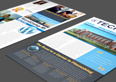
The new solution provides a more professional look and feel to the overall design. Only three different fonts and this avoids chaos. For the most part, I stuck with the NEIT color scheme to provide unity throughout the document. Here is my new design solution:
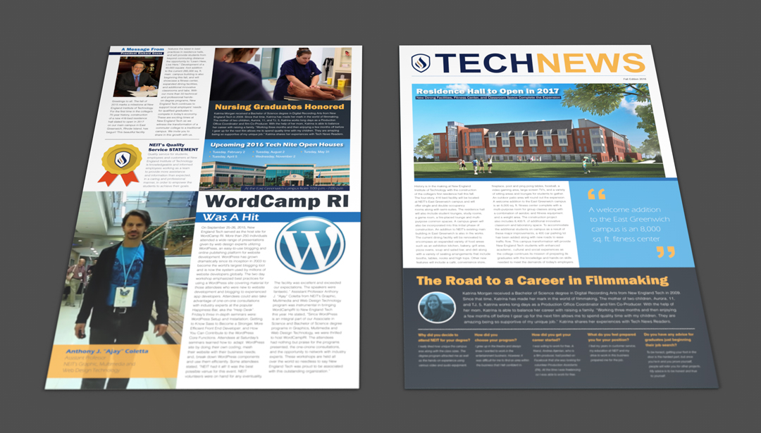
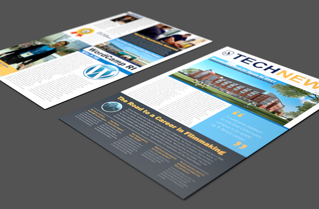
The new solution provides a more professional look and feel to the overall design. Only three different fonts and this avoids chaos. For the most part, I stuck with the NEIT color scheme to provide unity throughout the document.

