Creating My Own Wine Labels
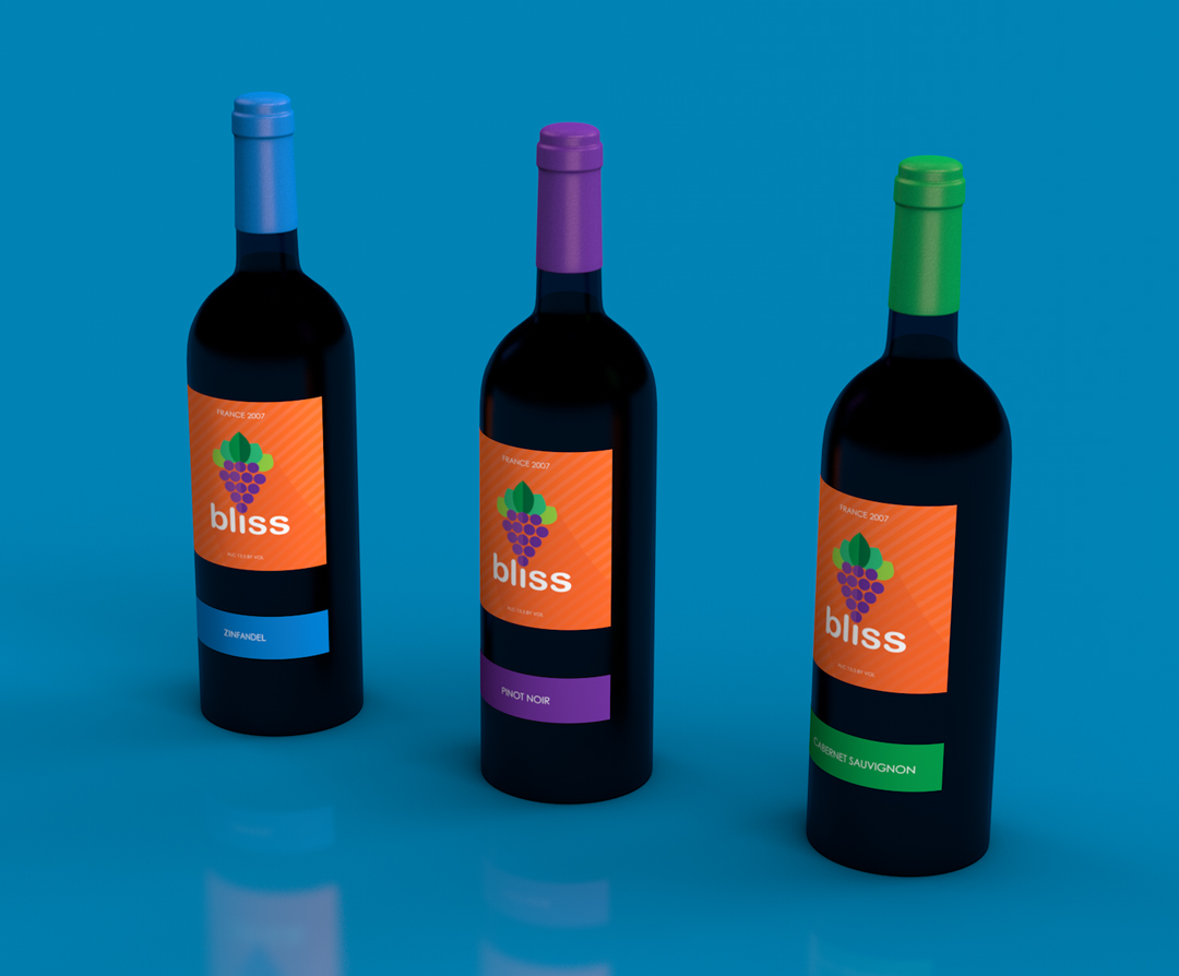
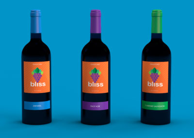
I was challenged to create wine label designs based off of my last name. I have learned a lot making these wine bottles in both typography and design. I wanted to make three brand extensions with subtle differences. I also was designing while knowing that I would be creating them in 3D software (Cinema 4D).
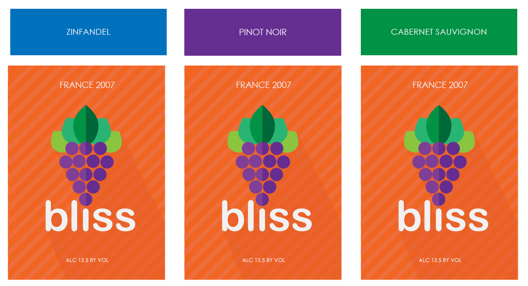
As soon as this project was assigned, my immediate thoughts went to one of my favorite design styles, which is flat design. I also wanted to make note to use bright colors and a fun, playful font. I wanted grapes to be the main point because it is what wine is made from. The overall composition provides a colorful approach that makes the wine feel more fruit oriented. The color combinations compliment each other and would live harmoniously with the variations on the shelf. I chose orange as the most prominent color because it incites comfort, warmth and fun psychologically. The green leaves incite balance, harmony and peace; this accommodates the feel of the orange I chose. Additionally, the font choice is a rounded sans serif to further the “friendly” feel.
Technical Information
First, these designs started out as sketches in my brainstorming process. Once I had a couple of concepts, I scanned them into Adobe Illustrator. I then began to convert them into vector illustrations. After that, I chose a color pallet, chose a font and honed in on the overall design. Lastly, I imported them into Cinema 4D and rendered the wine label designs applied to the actual bottles.
